You've seen the pattern: someone builds a "template," shares it with the team, and within three weeks every deck looks different. Fonts drift. Colors mismatch. Slide structures vary wildly. The template didn't fail because of bad design — it failed because it wasn't built as a system.
A presentation template that works has three properties: it constrains choices (so people can't go off-brand), it provides enough layouts (so people don't need to improvise), and it's documented (so people know which slide to use when). This guide walks through building one that holds up.
Start With the Slide Master, Not the Slides
The single most common mistake is designing individual slides and calling the result a template. A real template lives in the Slide Master view (PowerPoint) or Theme (Google Slides / Keynote). The master defines what's editable and what's locked.
In PowerPoint, go to View > Slide Master. Here's what to set up:
- Fonts: Define a heading font and body font. Once set in the master, every text box defaults to these. People can override, but the default is correct.
- Colors: Create a theme color palette with 6-8 colors. Label them by purpose (Primary, Secondary, Accent, Background, Text) not by hue. This makes the right choice obvious.
- Placeholders: Use content placeholders, not text boxes. Placeholders respect the master formatting; text boxes don't. This is the #1 reason templates drift.
The placeholder rule
If a team member can delete your carefully styled text and type something in a different font, your template will break. Content placeholders prevent this — they enforce the master's formatting on everything entered into them.
Define Your Layout Set
A template needs enough layouts to cover real content without being overwhelming. Too few layouts, and people improvise. Too many, and people can't find the right one. We've found that 8-10 layouts cover 95% of business presentations:
- Title slide — Presentation name, date, presenter
- Agenda / Section divider — Marks topic transitions
- Text + image (left/right) — The workhorse layout
- Full image with caption — For impactful visuals
- Bullet points (single column) — Simple content slides
- Two-column comparison — Side-by-side content
- Data / chart slide — Chart placeholder + key takeaway
- Quote / pull quote — Single statement, large type
- Team / grid layout — Multiple items in a grid
- Closing / Q&A slide — Consistent ending
Each layout should have placeholders pre-positioned and pre-styled. When someone adds a new slide and picks "Text + image (left)," the result should look correct immediately — no manual adjusting needed.
Establish Visual Hierarchy Through Type
Consistency in typography does more for professional appearance than any visual flourish. Define three text levels:
- Slide title: 28-32pt, heading font, bold or semibold
- Body text: 18-22pt, body font, regular (never smaller than 14pt for readability)
- Caption / annotation: 12-14pt, body font, light or italic
That's it. Three levels. If you define more, people won't remember the distinction, and your hierarchy collapses. For deeper principles on how visual hierarchy shapes communication, the same rules apply that we discuss in our spreadsheet design guide — clarity through constraint.
Build a Color System, Not a Color Palette
Having brand colors isn't enough. You need rules for how they're used:
- Background: White or very light neutral (95% of slides)
- Text: Dark gray or near-black (never pure black — it's harsh)
- Primary accent: Used for titles, key data points, and section dividers
- Secondary accent: Used sparingly for emphasis or comparison
- Callout / warning: Reserved for attention-needed moments only
The key principle: if everything is accented, nothing is. Reserve color for meaning, not decoration.
Handle Images Intelligently
Images are where templates most often fall apart. Team members paste images at random sizes, stretching layouts. Build image handling into the template:
- Use picture placeholders with locked aspect ratios
- Pre-define image positions for each layout (left-aligned, centered, full-bleed)
- Include a "full-bleed image with overlay text" layout for hero slides
- Set crop and fit defaults so images fill placeholders cleanly
Document the Template
This is the step everyone skips, and it's why templates fail. Include a "How to use this template" section at the start of the file (hidden slides, or a separate guide):
- Which layout to use for which content type
- How to add images without breaking layouts
- When to use accent colors (and when not to)
- How to create section dividers
- What not to do (override fonts, add text boxes, use outside colors)
A 2-minute guide prevents 2 hours of cleanup per deck.
Test With a Real Presentation
Before finalizing your template, build a real 15-slide presentation with it — ideally one that already exists. You'll discover immediately which layouts are missing, which are redundant, and where people will be tempted to improvise. Revise based on what you find.
Lock What You Can
PowerPoint allows you to lock master elements so they can't be accidentally moved or deleted. Google Slides has more limited options but you can protect the master. Use these features. A template that can be accidentally broken will be accidentally broken.
Version and Maintain
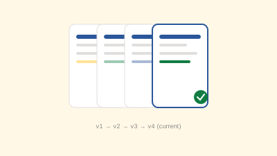
Templates evolve. Brand colors shift. Fonts change. Version your template file (e.g., CompanyName-Template-2026-v1.pptx) and announce updates clearly. Old decks won't update automatically, but new ones will start from the current version.
For teams that also struggle with file naming and version chaos, our guide on version control for documents pairs well with this — the same naming discipline applies.
The Payoff
A well-built template saves every team member 30-60 minutes per presentation — no more fiddling with alignment, fonts, or colors. More importantly, it makes every deck from your organization look like it came from the same place. That consistency builds credibility, whether you're presenting to clients, executives, or each other.